Head in the (Word) Clouds, Feet on the Ground
One of the teams I used to work on at my company had a tradition of creating friendly little word clouds that they would printout and give to team members on their birthday. They were easy to make, and a fun alternative to the standard birthday card, but I never gave word clouds much serious thought as a data visualization tool. To me, they were merely a fun diversion and a nice decoration to liven up my drab cubicle walls.
It turns out that word clouds are a popular data visualization tool, especially for displaying word frequency in a given body of text. The most common approach is to correlate the size of the words in the cloud with how frequently the word appears. Ergo, the larger the word, the more often it showed up. Here’s an example made from the text on our company’s public homepage.
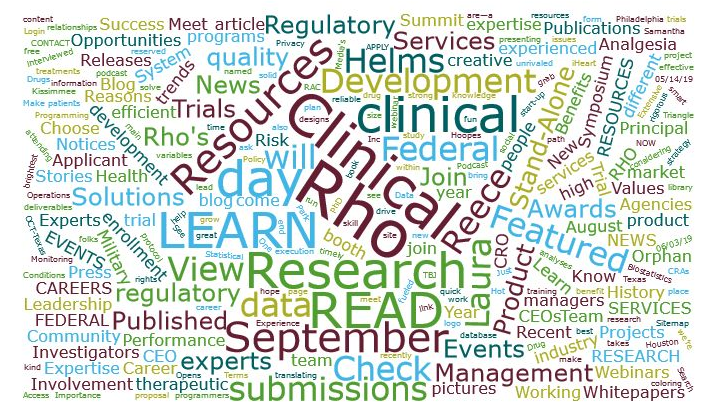
No surprise, the company name, “Rho” is the largest because it appears most often, followed by the words “Clinical” and “Research” (Rho is a clinical research organization).
So, this can certainly be an interesting way to visualize data, but something about the word cloud makes it feel less “professional” than some of our more tried and true visualization tools - like histograms, line graphs, and box plots. It feels more like a middle school art project than an analysis tool.
So, I was curious to see if I could find any information about the usefulness and reliability of word clouds as a robust visualization method. Google led me to this article by Enrico Bertini, Associate Professor of Computer Science and Engineering at NYU, about deconstructing word clouds. Bertini and his colleagues looked at the design of word clouds and identified 3 key layout strategies and 5 information encoding principles, which they used to create 15 different word cloud designs. Then they identified a set of 4 tasks for which word clouds might commonly be used, and asked a simple question: which designs were most effective at completing each task?
You can read the article to get the nuance, but in summary they found that:
- Using supplemental graphics (e.g., bars, circles) overlaid with the words was most effective for assessing quantitative values of a point.
- Using varied font size and color intensity were most effective when the task was to search for individual words, but the utility of these font properties is most pronounced when the font is large - the smaller the font, the harder it is to perceive the differences. (You can get a good feel for this challenge in our example above. Once you get below the top 3-4 words, it becomes hard to distinguish the difference between individual words.)
- The advantages described above are diminished and inconclusive for tasks of greater complexity.
- Sometimes, a simple list was more effective at achieving the desired result than using the more complex visualization of a word cloud.
All of the results seem pretty intuitive, but having these quantitative results helps us when it comes to making decisions about visualizations. In our Data Science team, we are often tasked with coming up with “the right visualization for the job.” Digging into research like this and understanding concepts like cognitive psychology, perception, and visual processing help us improve how we work.
So, what’s the verdict on word clouds? They have some value for visualization, but for much of our work, we probably have better visualization methods at our disposal. Still, word clouds have a certain aesthetic appeal to them. After all, I’ve yet to receive a birthday bar chart or scatter plot that made its way up on my cube walls.
For a more in-depth look, you can read the conference paper Bertini and his colleagues presented at IEEE Viz.