Text Mining in Asthma, Allergy and Immunology - Part 1 of 2
In the field of clinical research, many important deliverables exist in the format of a PDF or other text-based document. Examples range from Protocols, SAPs, and CRFs to Manuals and Reports. These documents are essential for guiding research and disseminating results, but Researchers already derive great value from these documents as they read and reference them throughout the life of a study. But what if we could extract even more value from these same resources, even long after a study has been completed? This idea motivated our interest in text mining, which is an extensive analytical domain centered on deriving quality information from text documents. To showcase our explorations into the world of text mining, we present this blog post focusing on some of the simpler techniques we applied to study protocols.
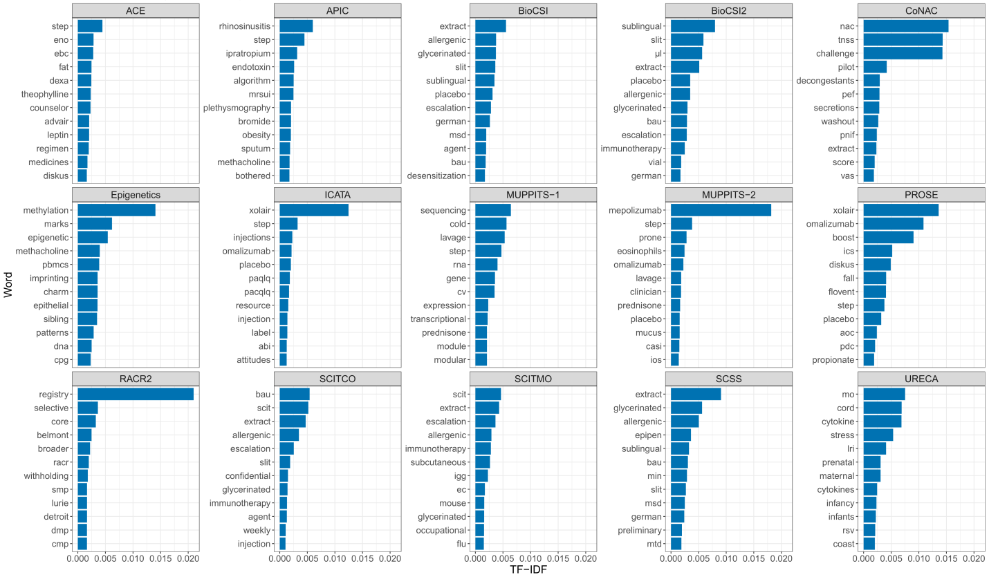
We began by selecting a set of 15 protocols from studies within the Inner City Asthma Consortium (ICAC). Each study captures a unique aspect of the disease, and some are more alike than others. From these 15 ICAC protocols, we obtained word counts, and calculated a statistic called TF-IDF (term frequency-inverse document frequency). TF-IDF is a metric capturing the uniqueness and frequency of a word that appears in a document. For example, if we decided to only use raw term frequency as our metric of importance, the word ‘Asthma’ would receive a high score for each of the documents, but that doesn’t help us understand what makes each document unique. By penalizing these common words, TF-IDF helps us find words that are meaningful rather than just frequent. Using TF-IDF values, we plotted the top 12 most meaningful words in each document:
Top 12 Meaningful Words by Study
Graphic Code
#################################################
#   Load libraries
#################################################
library(tidyverse)

#devtools::install_github("dgrtwo/drlib") #NEED TO INSTALL THIS PACKAGE FOR FACETS TO DESCEND
library(drlib)

#################################################
#   Set working directory
#################################################
setwd("./prog")

#################################################
#    Load data
#################################################
dp <- readRDS("../data/icac_protocols.Rds")


#################################################
#    Figure - top words by study based on tf-idf
#################################################

pdf(file = "study_top12word_barchart.pdf", width=20, height=12)

dp %>%
  group_by(study) %>%
  top_n(12, tf_idf) %>%
  ungroup() %>%
  mutate(word = reorder(word, tf_idf)) %>%
  ggplot(aes(reorder_within(word, tf_idf, study), tf_idf)) +
  geom_col(show.legend = FALSE, fill="#0072B2") +
  scale_x_reordered() +
  facet_wrap(~ study, scales = "free_y", ncol = 5) +
  xlab("Word")+
  ylab("TF-IDF") +
  coord_flip() +theme_bw() +
  theme(axis.title=element_text(size=16), strip.text = element_text(size=14), axis.text=element_text(size=13),
        plot.title = element_text(size=20)) +
  ggtitle('Top 12 Meaningful Words by Study')

dev.off()
In these plots, each panel represents a study/document, the y-axis contains the top 12 words by document, and the x-axis shows the TF-IDF. Notice that TF-IDF is comparable between documents. For example, “extract” is uniquely and commonly found in multiple immunotherapy studies such as SCITCO, SCITMO, and SCSS, while “registry” is unique to RACR2, the only registry study of the group. For this reason, the bar for “extract” has a lower magnitude than the bar for “registry”. The top words in the panels give us clues about key features of the studies. For example, “Xolair”/”omalizumab” are treatments provided in both ICATA and PROSE, and “mepolizumab” is the treatment given in MUPPITS-2.
So why should you care about this simple technique?
We just turned documents into numbers - and numbers unlock efficient analysis. Finding answers to important questions about these documents no longer requires reading all 15 of them. Let’s see what answers we can find!
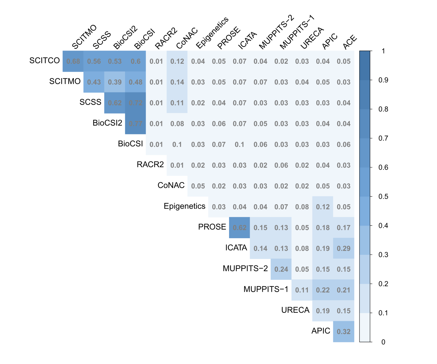
Using this metric as our base, we can apply another common text mining technique to determine the similarity of documents: cosine similarity. The following heatmap displays the results of this analysis; the darker the square the more similar the documents are.
Heatmap of Cosine Similarity between Study Protocols
Graphic Code
#################################################
#   Load libraries
#################################################
library(tidyverse)
library(tidytext)
library(proxy)
library(corrplot)

#################################################
#   Set working directory
#################################################
setwd("./prog")

#################################################
#    Load data
#################################################
dp_sim <- readRDS("../data/icac_similarity.Rds")


#################################################
#    Figure - top words by study based on tf-idf
#################################################

pdf(file = "study_similarity_corrplot.pdf", width=12, height=10)


col <- colorRampPalette(c("#BB4444", "#EE9988", "#FFFFFF", "#77AADD", "#4477AA"))

corrplot(corr=dp_sim, method="color",
         col =  col(20),
         type="upper",
         order="hclust",
         hclust.method = "ward.D2",
         tl.cex=1.3,
         cl.cex=1.2,
         number.cex=1.2,
         addCoef.col = "gray50", addCoefasPercent = FALSE,
         tl.col="black", tl.srt=45,
         diag=FALSE,
         cl.lim=c(0,1),
         cl.length=11,
         mar=c(1,1,1,1), is.corr = FALSE
)

dev.off()
Strong similarity scores exist between the immunotherapy studies (SCITCO, SCITMO, SCSS, BioCSI, and BioCSI2) and a few other small groups. For example, PROSE and ICATA share a very dark square, as they are highly similar studies due to their treatment (Omalizumab) and outcome a shared endpoint (exacerbations). Otherwise we can see that there is minimal relative similarity across the other studies.
However, there may be some nuances in the relationships that are hard to see. Let’s re-visualize these similarities using a network diagram, driven by TF-IDF as the metric. Each node will be a study protocol, and the strengths of the relationships between protocols will be represented by the thickness and darkness of the connection.
Network of Cosine Similarity between Study Protocols

Graphic Code
#################################################
#   Load libraries
#################################################
library(qgraph)


#################################################
#   Set working directory
#################################################
setwd("./prog")

#################################################
#    Load data
#################################################
dp_sim <- readRDS("../data/icac_similarity.Rds")


#################################################
#    Figure - top words by study based on tf-idf
#################################################

pdf(file = "study_similarity_network.pdf", width=10, height=8)

qgraph(dp_sim, layout='spring', vsize=8, node.width =1.2, label.cex=1.2, labels = colnames(dp_sim), minimum = 0.05)


dev.off()
That’s much better. Our findings from the heat map are confirmed: the immunotherapy studies are closely tied together with a few other strong associations in the network. It also looks like some natural groups are forming between the protocols. Let’s see if we can cluster them into groups using hierarchical cluster analysis, again using TF-IDF as the metric.
Study Protocol Clusters

Graphic Code
#################################################
#   Load libraries
#################################################

library(tidyverse)
library(tidytext)
library(proxy)
library(dendextend)
library(RColorBrewer)

#################################################
#   Set working directory
#################################################
setwd("./prog")

#################################################
#    Load data
#################################################
dp <- readRDS("../data/icac_protocols.Rds")


#################################################
#    Figure - top words by study based on tf-idf
#################################################

pdf(file = "study_similarity_cluster.pdf", width=10, height=6)

labels<- c('Immunotherapy','','','','Omalizumab','MUPPITS','Minimal Intervention')

cast_tdm(dp, word, study, tf_idf) %>%
  as.matrix %>%
  t()  %>% probably could have just used cast_dtm...
  dist(method='cosine')  %>%
  hclust(method="ward.D2") %>%
  as.dendrogram()  %>%
  color_branches(k=7, col=brewer.pal(9,'Set1')[-c(6:7)],groupLabels=labels, cex=1.2)  %>%
  set("labels_cex", 1.1) %>%
  plot(yaxt='n')


dev.off()
Here are the results of the cluster analysis in the form of a dendrogram. Short branches following splits indicate similarity, while longer branches following splits reflect large differences between the studies. As you can see, the analysis yielded 7 clusters, leaving RACR2, CoNAC, and Epigenetics in their own individual clusters. Now that we’ve defined our clusters, how can we determine what makes each one unique? Below we pooled the documents in each cluster and recalculated the TF-IDF values to answer this question the same way we did in the first figure.
Top TF-IDF words by Cluster

Graphic Code
#################################################
#   Load libraries
#################################################

library(tidyverse)
library(RColorBrewer)
#devtools::install_github("dgrtwo/drlib") #NEED TO INSTALL THIS PACKAGE FOR FACETS TO DESCEND
library(drlib)


#################################################
#   Set working directory
#################################################
setwd("./prog")

#################################################
#    Load data
#################################################
dp <- readRDS("../data/cluster_tfidf.Rds")


#################################################
#    Figure - top words by study based on tf-idf
#################################################

pdf(file = "cluster_top12word_barchart.pdf", width=17, height=9)

#Plot Tf-IDF by cluster
dp %>%
  group_by(clust2) %>%
  top_n(12, tf_idf) %>%
  ungroup() %>%
  mutate(word = reorder(word, tf_idf)) %>%
  ggplot(aes(reorder_within(word, tf_idf, clust2), tf_idf, fill = clust2)) +
  geom_col(show.legend = FALSE) +
  scale_x_reordered() +
  facet_wrap(~ clust2, scales = "free_y", nrow = 2) +
  xlab("Word")+
  ylab("TF-IDF") +
  coord_flip() +
  theme_bw() +
  theme(axis.title=element_text(size=18), strip.text = element_text(size=18), axis.text=element_text(size=14),
        plot.title = element_text(size=20)) +
  scale_fill_manual(values = brewer.pal(9,'Set1')[-c(6:7)])


dev.off()
The top words for the clusters often provide convenient cluster names or clearly show shared treatments or outcomes as key commonalities. For some, like ‘Minimal Intervention’, clusters have formed that we might not have expected, but these are often the most exciting as they provide information we would not have found otherwise.
Using text mining we’ve been able to determine what makes documents unique, and explore relationships between them. What other possibilities are thereexist for text mining in clinical trials research?
That’s what we’ll touch on next time when we scratch the surface of some of the applications for text mining in clinical trials research in Part 2.
Additional Info and References
In case you haven’t noticed, the code for each graphic is provided beneath it. The protocols that served as data for this blog post, however, cannot be shared. Here’s a code snippet from our data derivation process that’ll give you an idea of what we did:
Data Derivation Code
Code for generating tf-idf matrix
library(tidyverse)
library(tidytext)

dp <- data_frame(path = protocol_files,
                 doc = basename(protocol_files)) %>%
  separate(doc, c("study","extra"), extra="merge") %>%
  mutate(study = case_when(
    study=="Protocol" ~ "URECA",
    study=="ICAC" ~ "MUPPITS-1",
    study=="MUPPITS" ~ "MUPPITS-2",
    TRUE ~ study)) %>%
  mutate(text = map_chr(path, ~ pdftools::pdf_text(.) %>%
                          paste(., collapse=" "))) %>%
  unnest_tokens(word, text) %>%       ### 1 rec per word per doc
  #filter(!str_detect(word, "[0-9]") & !str_detect(word, "[:punct:]"))
  anti_join(stop_words) %>%           ### remove stop words
  mutate(word = str_replace_all(word, "[0-9]", ""),       #remove numbers from words
         word = str_replace_all(word, "[:punct:]", ""),   #remove punctution from words
         word = trimws(word)) %>%                         #trim white space off the ends of words
  anti_join(stop_words) %>%           ### remove stop words again
  filter(!is.na(word) & !word=="") %>%                    # remove missing/empty strings
  filter(!nchar(word)==1) %>%
  select(study, word)%>%
  count(study, word)  %>%
  bind_tf_idf(word, study, n) %>%
  arrange(desc(tf_idf))
Code for generating similarity matrix
library(tidyverse)
library(tidytext)
library(proxy)

dp_sim <-dp %>%
  cast_dtm(study, word, tf_idf) %>% #Create Document-Term Matrix
  as.matrix %>%
  simil(method='cosine', diag = TRUE) %>% #Calculate cosine similarities
  as.matrix(diag=0)
The Text Mining with R (Silge & Robinson 2019) book was very helpful in the creation of this post!
The following R packages were used in this post:
- tidyverse
- tidytext
- proxy
- dendextend
- corrplot
- qgraph
- RColorBrewer
- drlib (helpful for ggplot facets)